


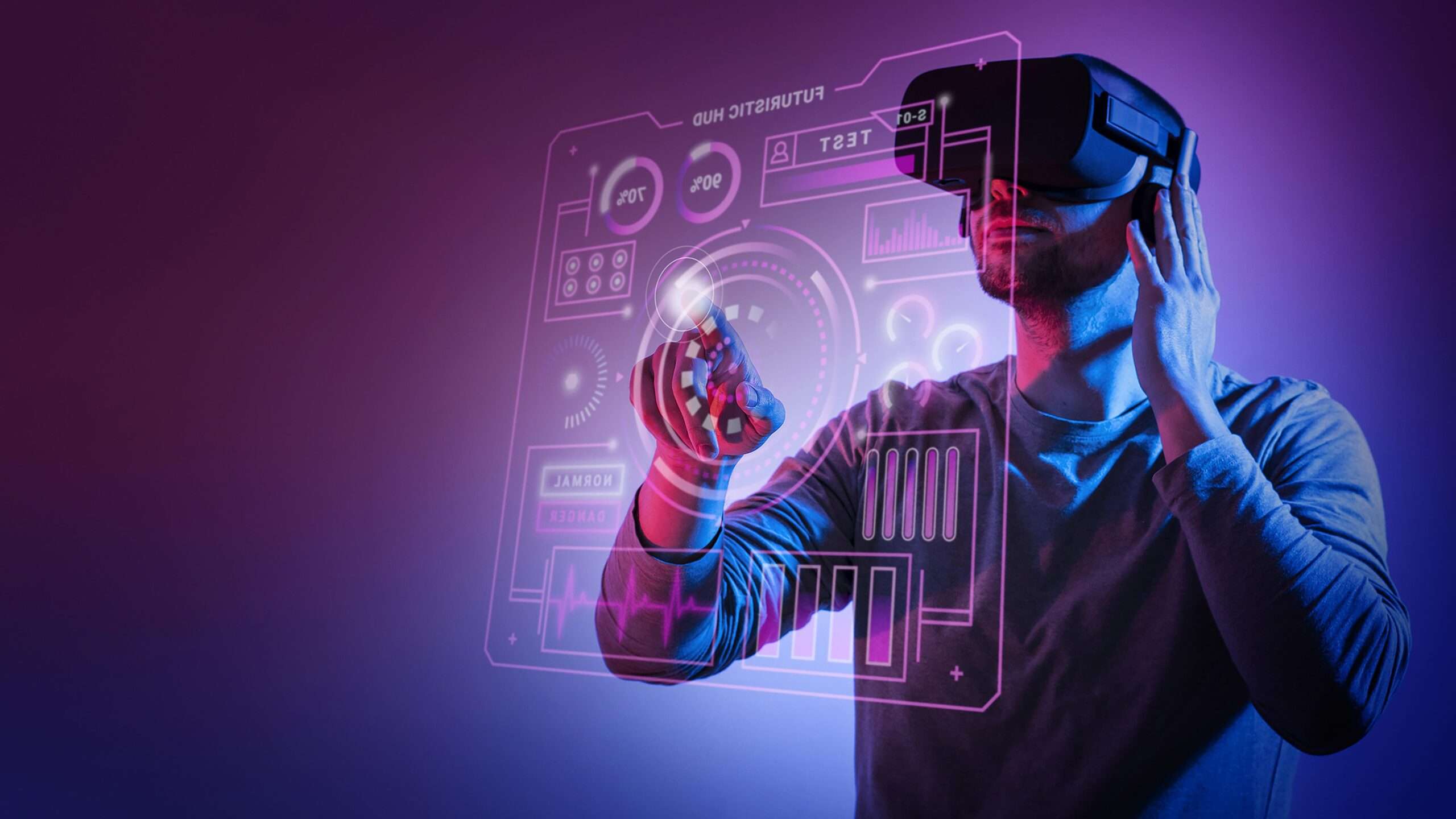
Artificial intelligence (AI) is revolutionizing the e-commerce industry by enabling personalized shopping experiences, automated support, and data-driven decision-making.

In today’s competitive digital world, pre-made website templates may not always meet your business’s unique needs. That’s where custom website development comes in.
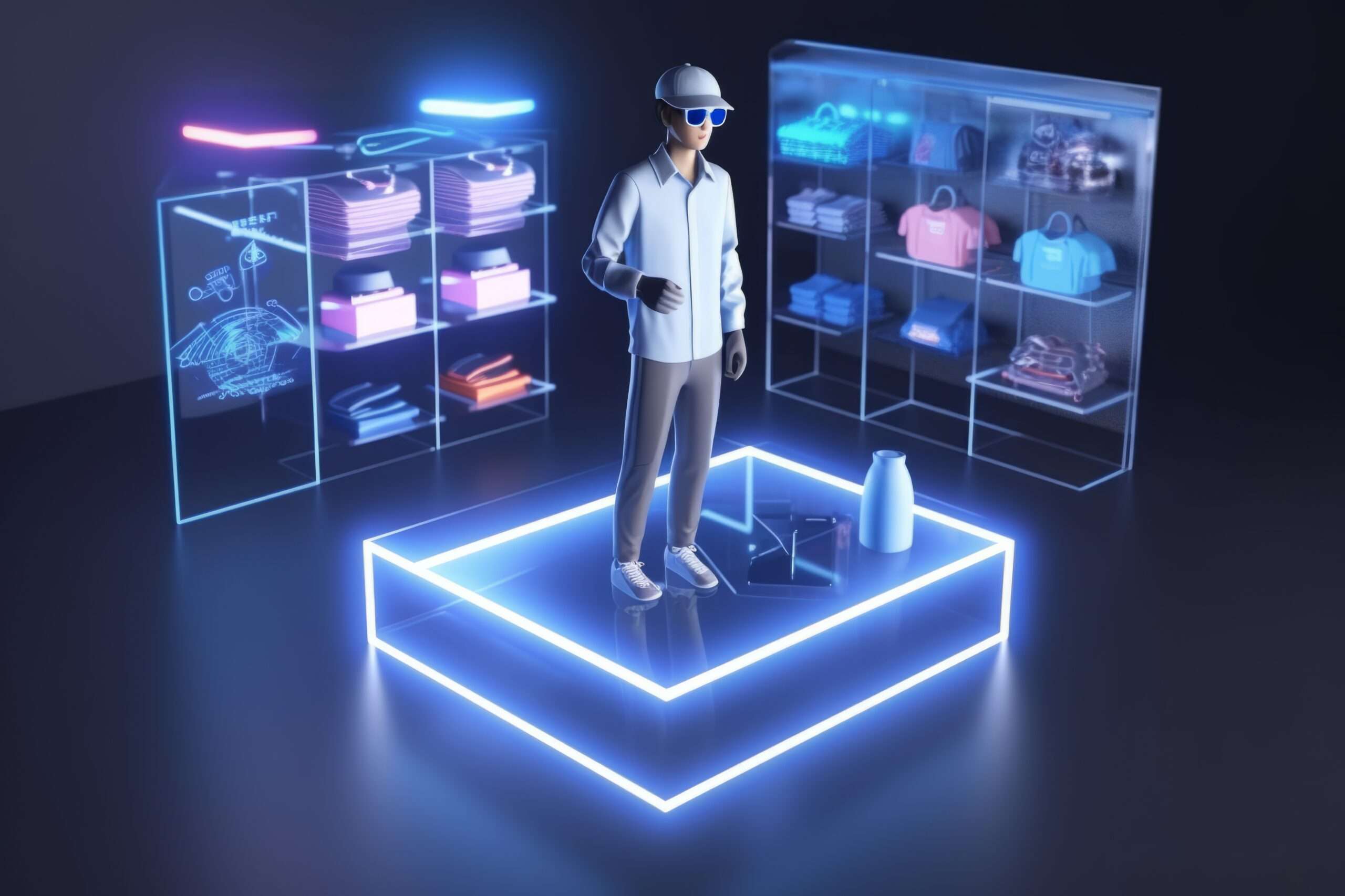
E-commerce has undergone massive transformations over the past decade. With rapid technological advancements, the future of online shopping promises more personalization, automation.

